
Krispy Choppers
We collaborated with a cutting-edge, youthful chopper brand to ideate and execute their visual identity evolution, strategic brand narrative, and integrated marketing communications.
VISUAL IDENTITY


WHAT IS KRISPY?
Krispy had a really refreshing unique take on the chopper industry and wanted to be a community-focused brand that was inclusive and that meant...
No gatekeeping, everyone’s welcome, a no-judgement, open door policy to
encourage riders to get their choppers out of the garage and ride with friends new and old.
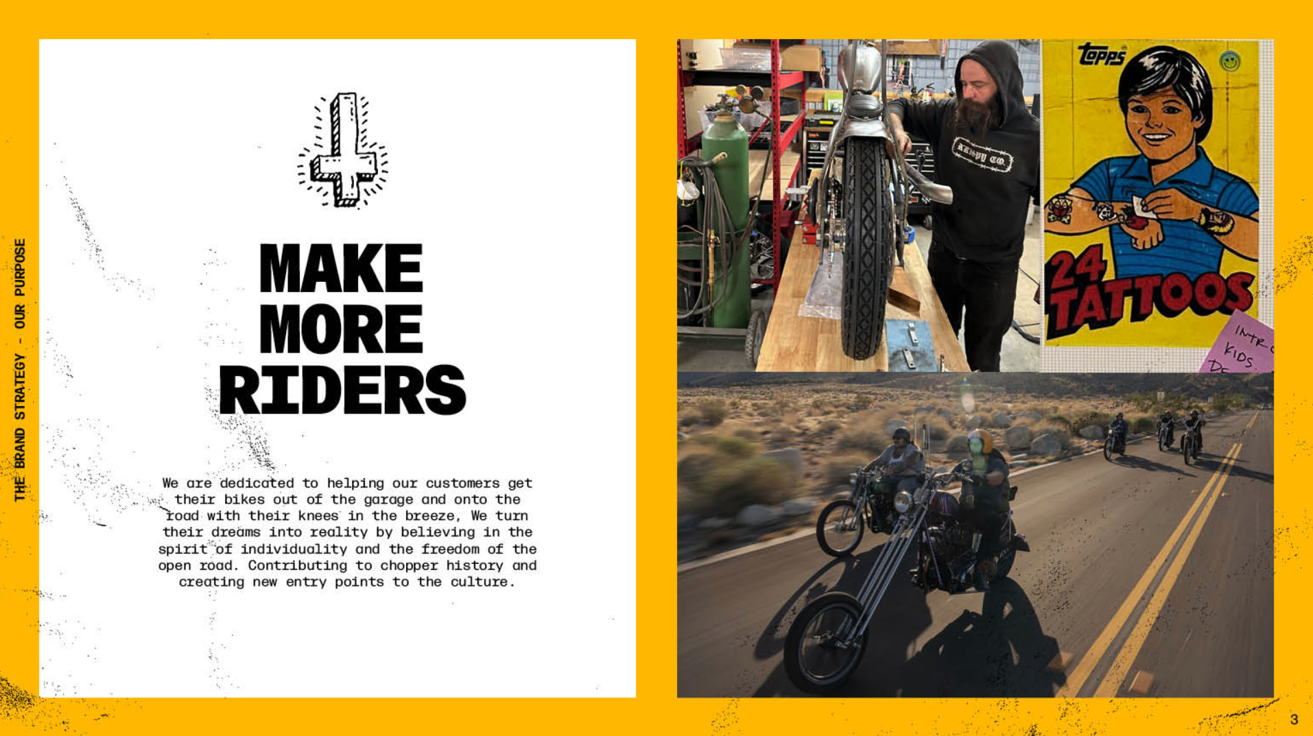
STRATEGY
“Make More Riders”


VISUAL IDENTITY
The Logo:
A very ownable wordmark with the Hardtail angle on that Krispy K
The Typography:
A primary typeface born out of engineering and construction, and a secondary casual dad handwriting
The Colors:
Approachable, inclusive and friendly
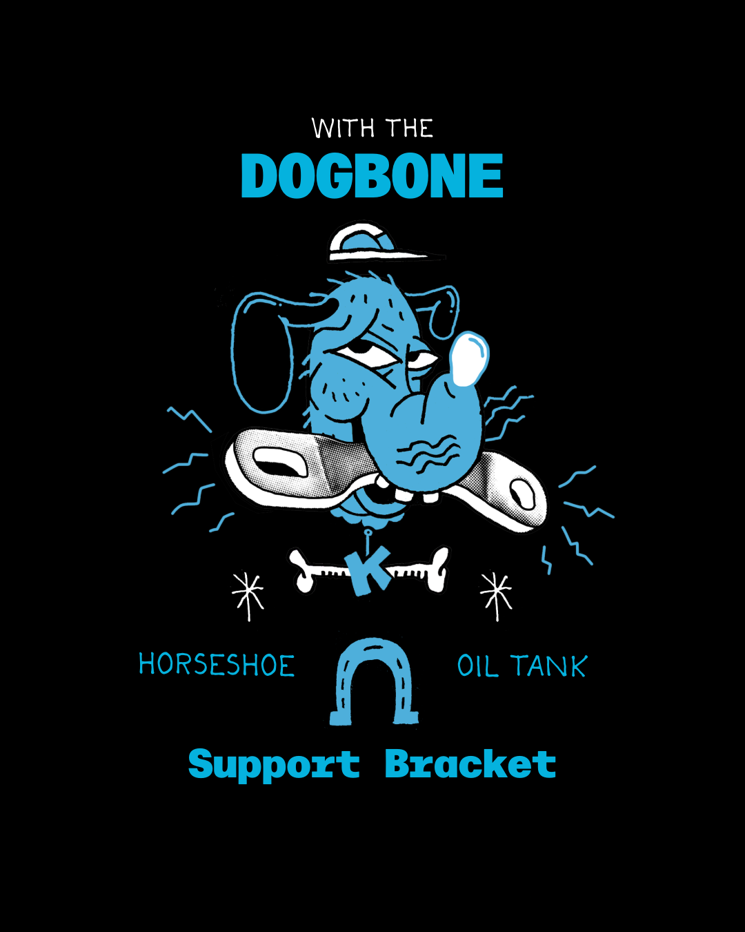
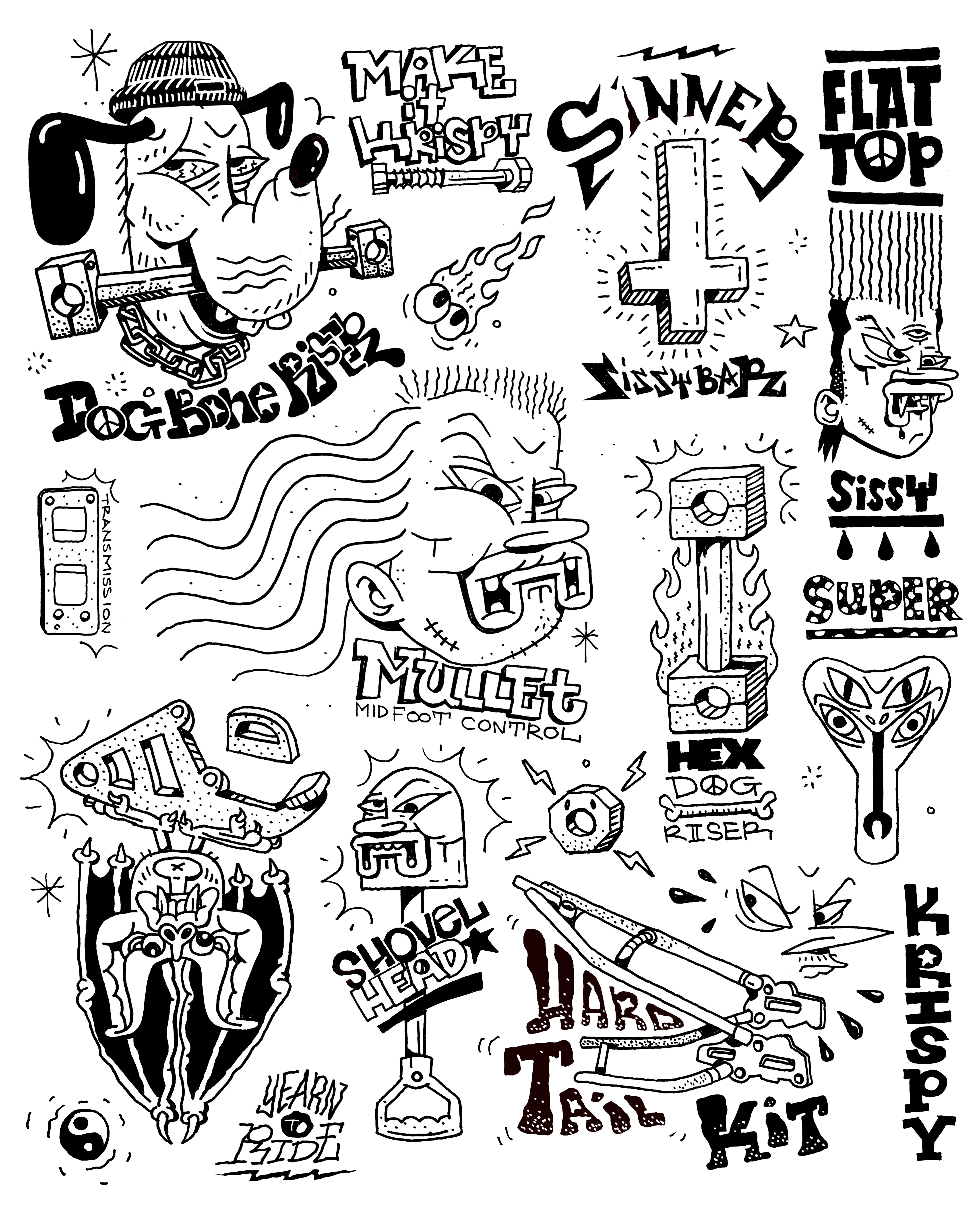
The Illustrations: Fun and loose!


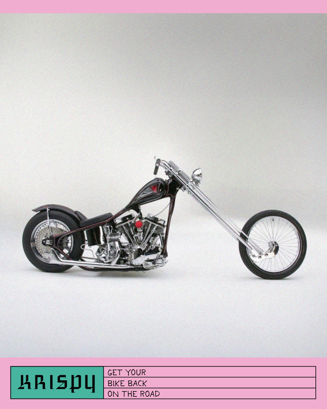
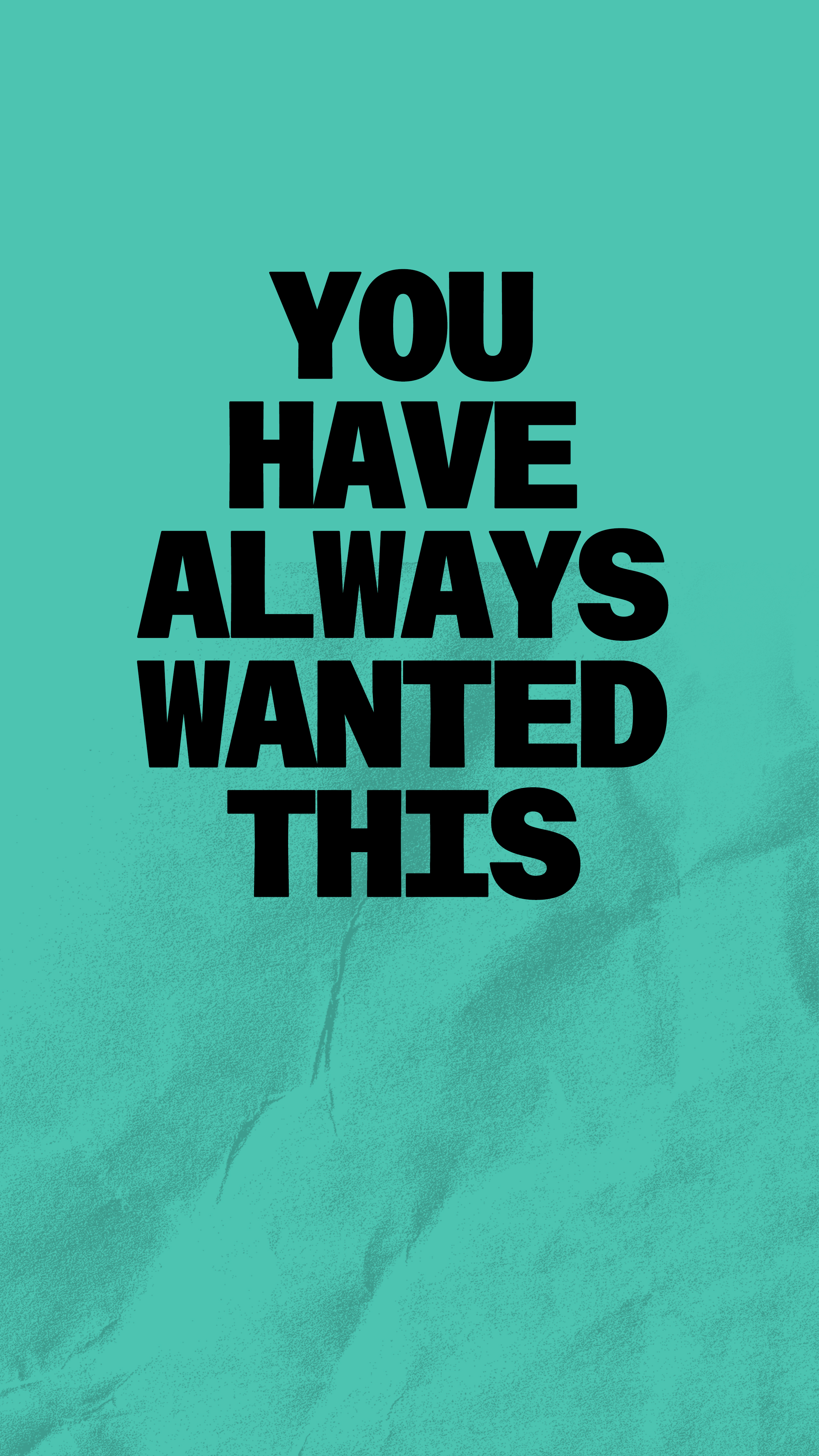
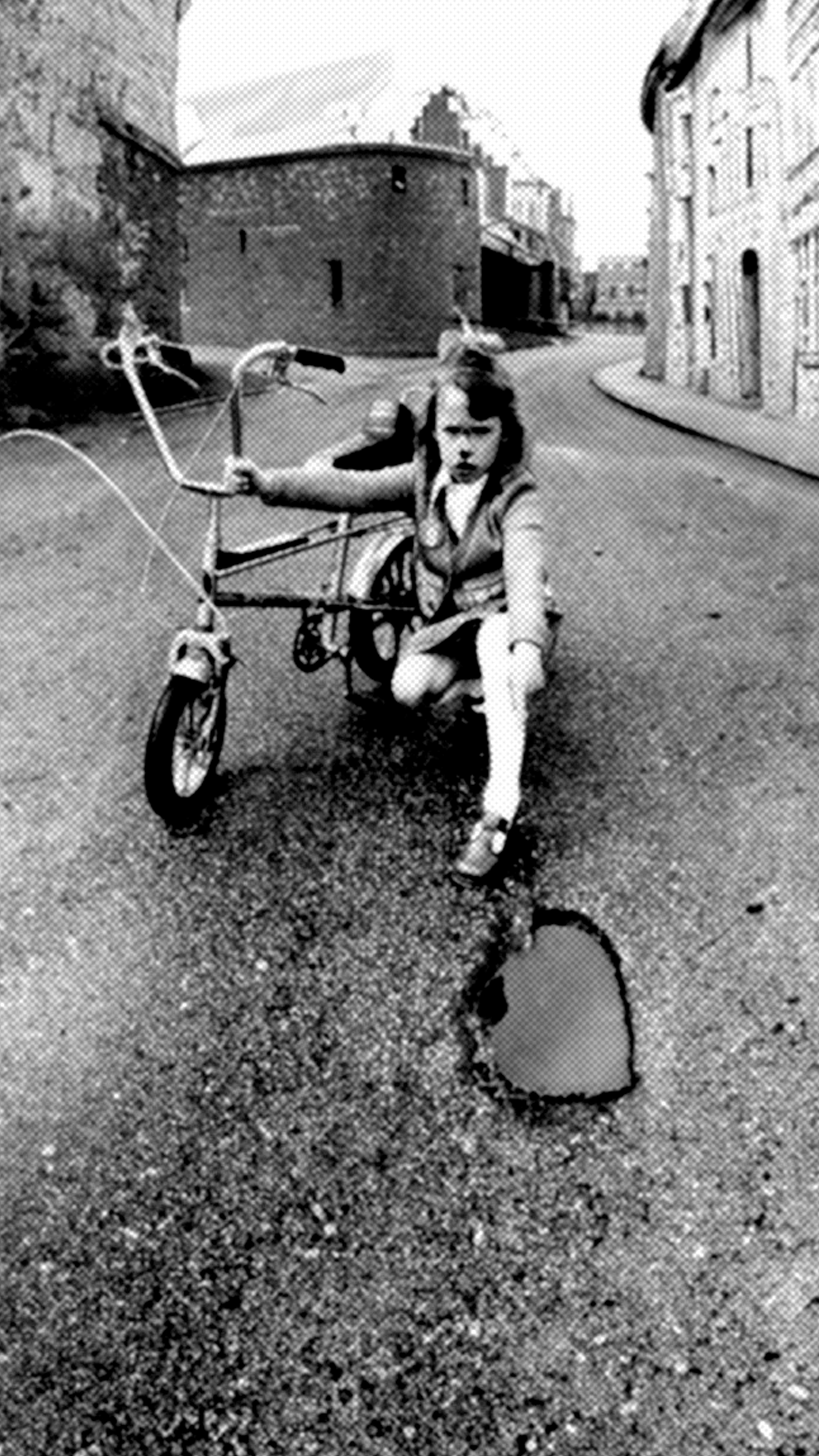
ADS
Endemic Audience:
A tone familiar with riders, showcasing parts and bike porn.


Non-endemic Audience:
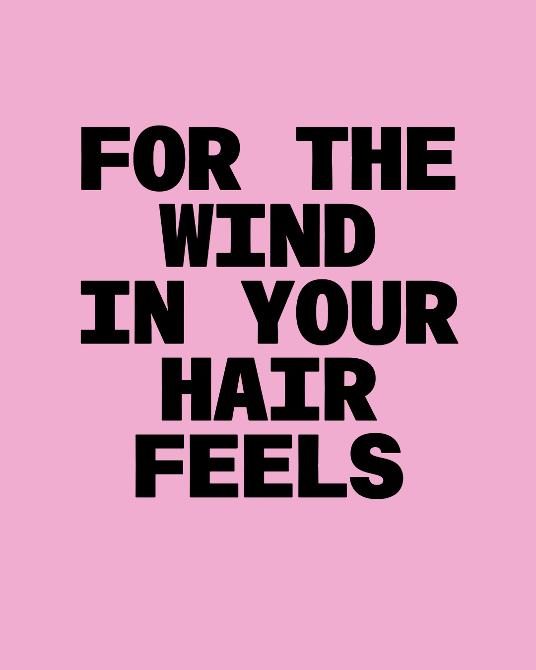
Unleash that inner child in you, start riding.
We ran these ads in adjacent media such as skate and snowboarding mags.


ILLUSTRATIONS
![]()
![]()
MERCH
![]()


BEHIND THE SCENES
We made a zine to showcase our ideas. We had fun.
